Hit enter to search

  • Noida
  • London
  • Leeds
  • USA
  • Durham
  • Spain

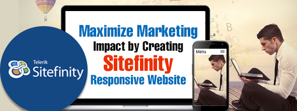
Maximize Marketing Impact with Sitefinity

Web experts and analysts have already stated with statistics that in the coming few years, mobile devices will dominate over laptops and desktops when it is all about accessing websites. Marketers have also realized that the use of data to personalize the online shopping experience has a greater impact on the ROI and the engagement factor. This in fact has pushed the web administrators to create their website that is partially or fully mobile friendly and responsive. It is here that Sitefinity shines as it’s built in responsive design capabilities address all the major concerns of the business owners with minimum efforts.

Maximize Marketing Impact with Sitefinity

A one size fits all user experience does not work for business. Offering each visitor a same experience do not get more leads or conversions. Marketers need to deliver a customized shopping experience that matches their interests. And for this creating a responsive website that can be accessed from any mobile device is a must.

Out of the box Sitefinity development comes with various features that can be used to create a responsive design if you want. Let’s take a look at them:

Naturally Responsive:

Small border for heading and paragraphs with multiple colors

Sitefinity is the only CMS platform that incorporates the responsive design directly into the CMS experience. This allows a single website to be easily accessed from an unlimited number of mobile devices. It is by using the drag and drop layouts that Sitefinity detects the site’s layout and the responsive rules instruct Sitefinity to transform the layouts according to the devices.

The Layout Widgets:

Small border for heading and paragraphs with multiple colors

This is the best way to solve your interface development headaches and provide ease of use to the end users by creating layouts that are responsive. These are called Layout Widgets that are .ascx files that define the HTML of the responsive grid. You can create them as per your requirements and add to your project via the Toolbox.

Personalization for Each Visitor:

Small border for heading and paragraphs with multiple colors

Displaying the right content to the right visitor helps to keep the audience engaged. Delivering personalized content is possible with Sitefinity development. This can be applied not only to a single page, but to the underlying templates. Powerful site transformations can be configured through these templates and they can be used to adapt the visual style of the site for each visitor based on their devices used.

Easily Accommodates Any Designs:

Small border for heading and paragraphs with multiple colors

Sitefinity offers full control of the website’s HTML markup and freedom to create any design. Each page is based on a template that contains editable regions that delivers content that authors can use. The interactive regions and the templates are completely under the designers control and this gives them the freedom to create any designs that are responsive.

Sitefinity development integrates all the popular device specific mobile strategies and device agnostic that can help you to keep your customers engaged and empower mobile employees. Thus, with Sitefinity, developers can easily create responsive web designs for tablets, smartphones and desktop computers. The set of adaptive styles conforms to an unlimited number of devices and their resolutions.

Call Us + 91 120 423 5665
Leave your name and mobile number, We will call you back

    [intl_tel* intl_tel-923 preferredCountries:in-ae-ca-us-au placeholder "Phone"]

    × Ask An Expert